")
")
{jcomments on}
The story of an...other photo
Premise
I was about to call this post "The story of a photo" when, uploading to the server the related images, I realized that, exactly one year ago, I had already posted an article with an almost identical title... ok, so this will be the story of a another photo, and...
...here it is (you see, I started this "chronicle" from the bottom, like in certain movies...)
 |
focusing@home |
The subject
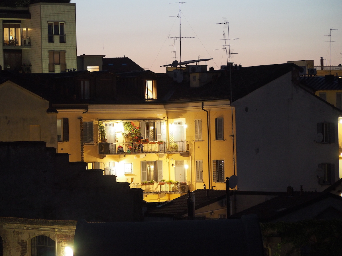
Anyone who has ever browsed the pages of this site will have seen appearing more than once the "case di ringhiera" (guard rail houses)(1) that I can see from my windows, mainly for three completely different reasons:
- they are close (according to Google Maps they are only 130mt/430ft from my house, beyond a group of low sheds that cannot hide them), I can shot them from my window without any effort, they are something that can be easily recognized by anyone and constitute a pleasant subject in case I have to do some tests, on both the photographic equipment' quality and on any shooting technique that I want to experiment or develop
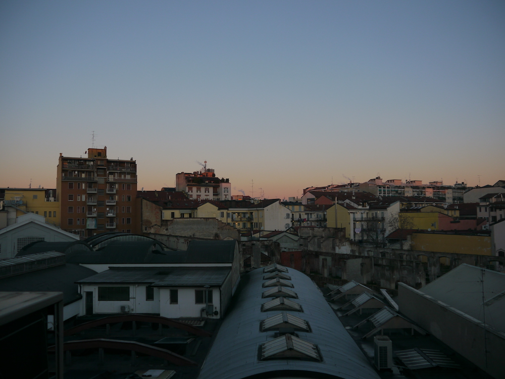
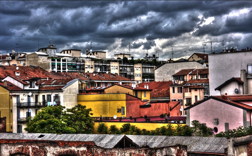
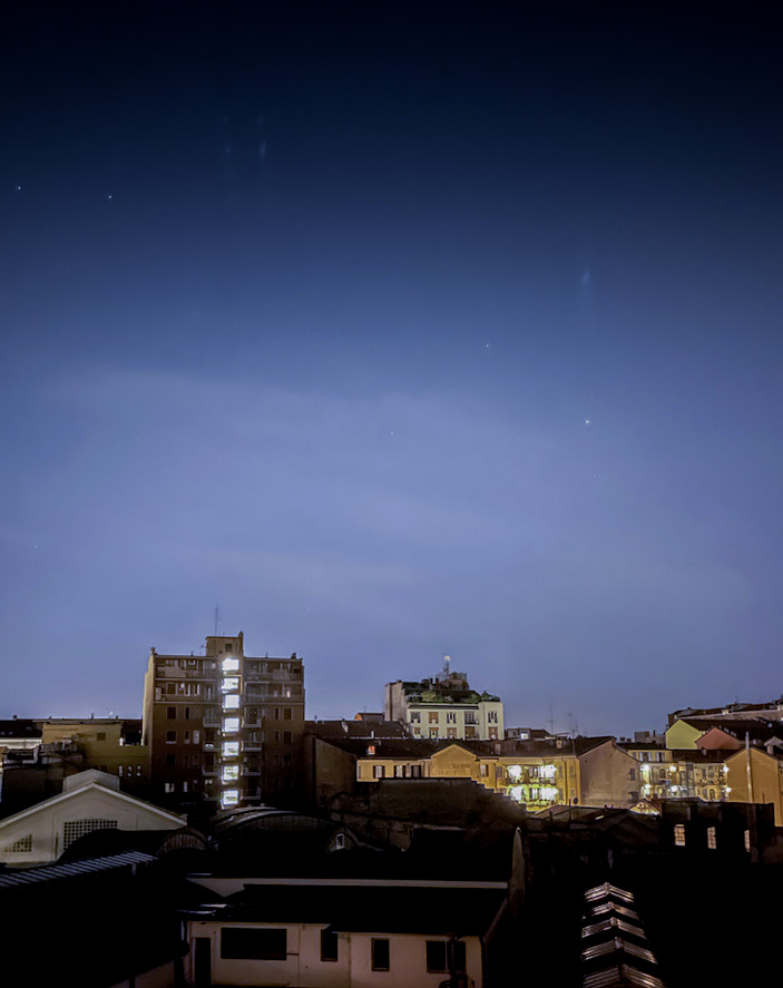
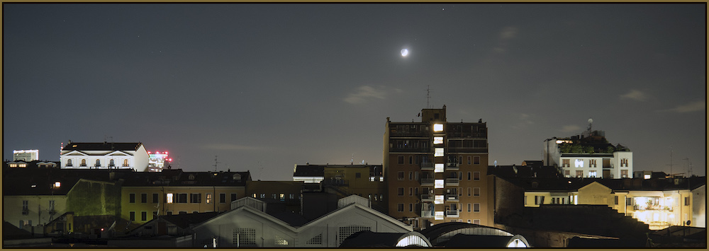
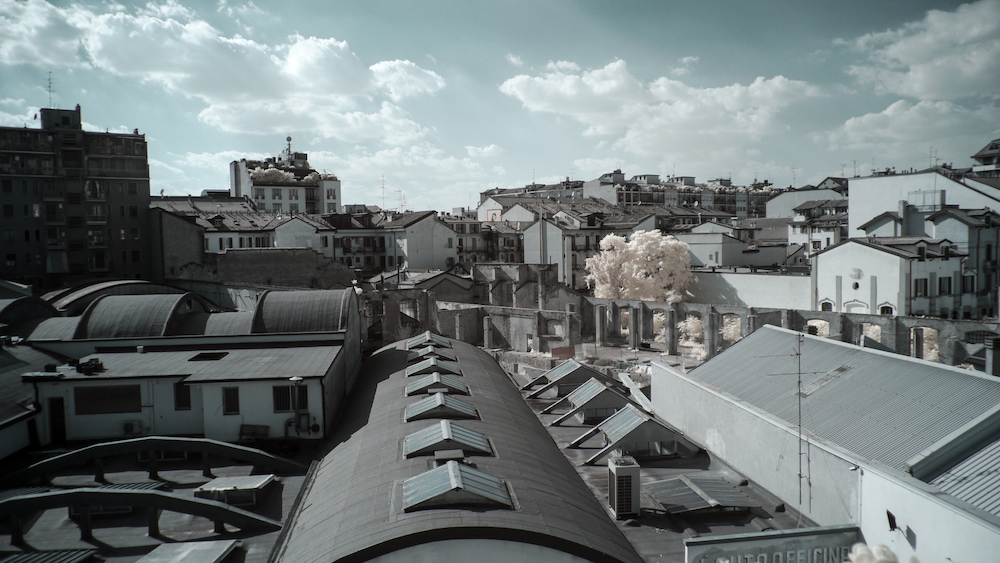
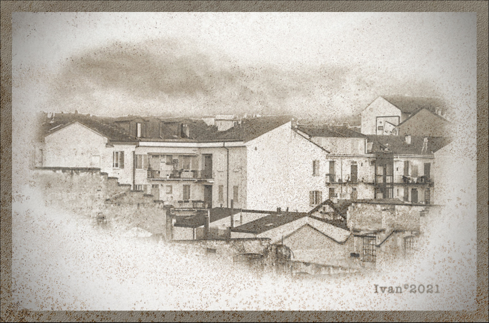
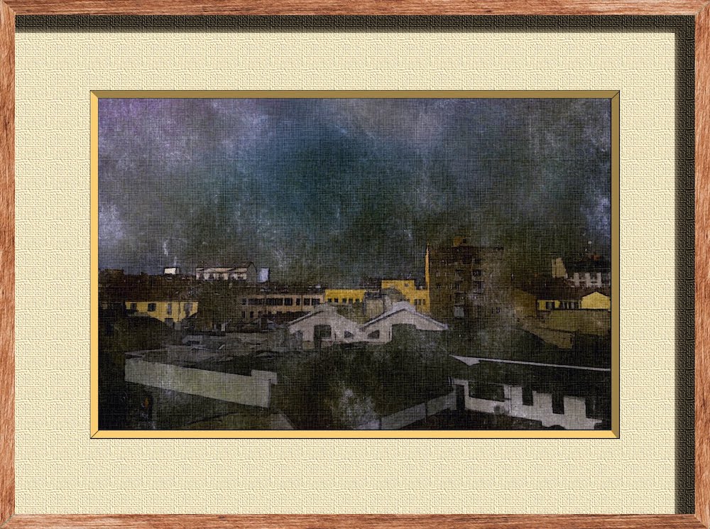
- they obviously always remain the same, even if the conditions in which they appear in a certain photography are instead very different from each other: at dawn, before a storm, at night, under infrared light, processed like a painting(2)… and this fact of witnessing the changing of seasons or the weather around something that instead remains steady, and being able to document it has always fascinated me
- they remind me that Milan is not just business, frenzy, modernity and depersonalization: there is (or was...) a time when people lived in small communities like these, where everyone knew and helped each other, and those houses were at the forefront(3) as far as hygiene and habitability were concerned
(1) these houses are one of the typical symbols of Milan in the last century, and from their original destination of public housing most of them have been transformed into fashionable lodgings (literally defined as cool in the so-called "modern Milanese", as it's ironically called that slang pathetically filled with English terms, often misused, which is widely abused here in the city...), no longer inhabited by workers or immigrants, but by those who want to stand out from the crowd or have an independent spirit, a bit "artistic" and a bit individualistic
(2) click here to see a collection of some of these images
(3) at the forefront… for that period (between the 19th and 20th centuries): today the idea of having to share the bathrooms with other families is simply unthinkable, and anyone who buys an apartment in a casa di ringhiera does so for the aesthetic charm of the building, but then completely renovates it inside, according to current standards (I know of cases in which, in order to have a "decent" surface, some people buys two adjacent apartments and then completely remakes them as one, two times bigger)
 |
 |
|
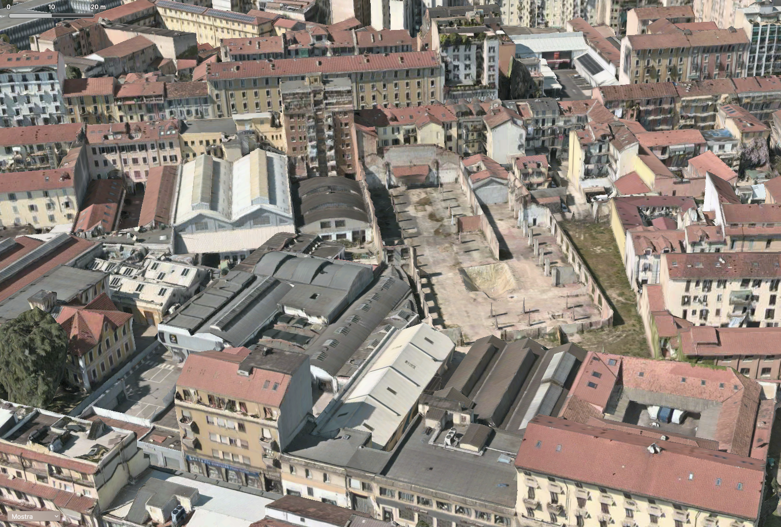
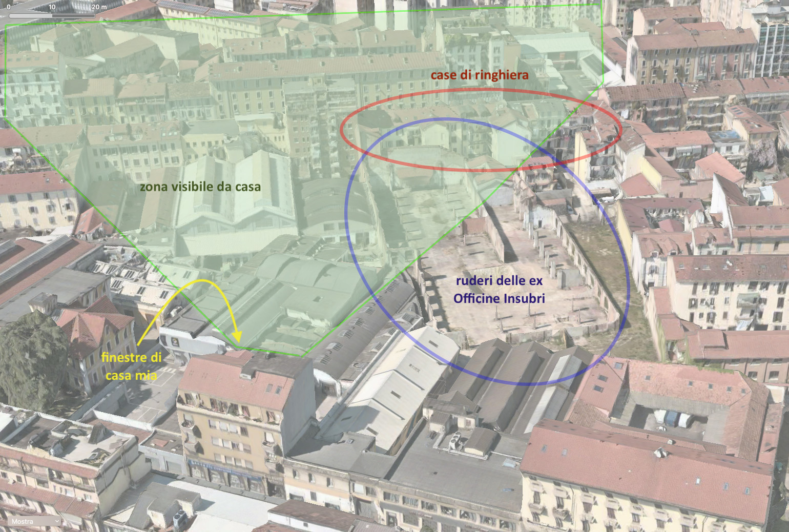
| The surroundings of my house (the triangular area between via Padova and viale Monza) in the 3D view of Milan provided by Apple's geographic tool, Maps: on the left as it appears from above, on the right labeled with the highlighted places which I refer to, and that so often appear in my photos | ||
The project
The basic idea
In a nutshell, I like these houses, even if actually I neither know who lives there nor I have ever been there, even though they are very close, and for all I have already photographed them several times I still have various projects focused on them(4)
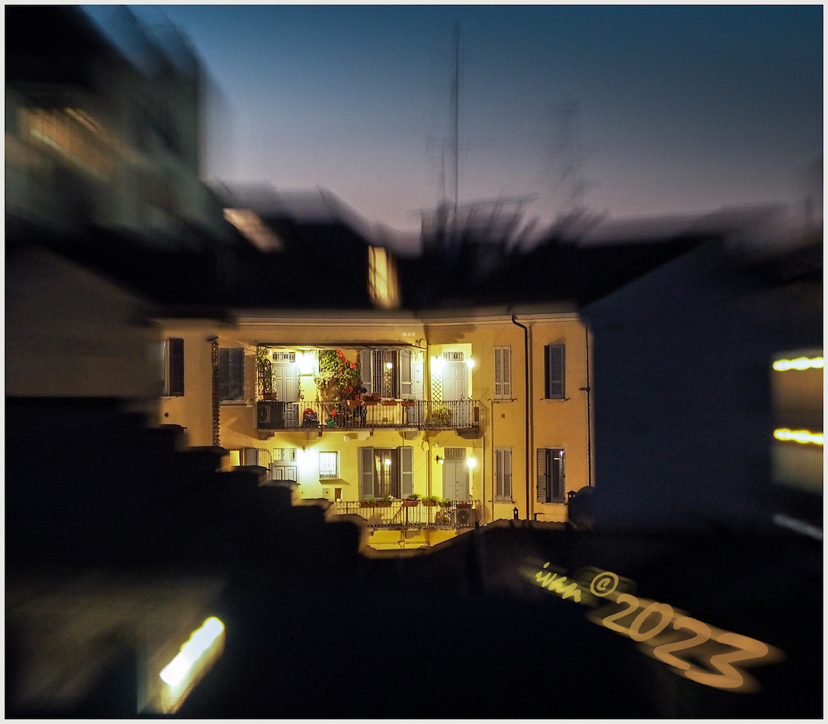
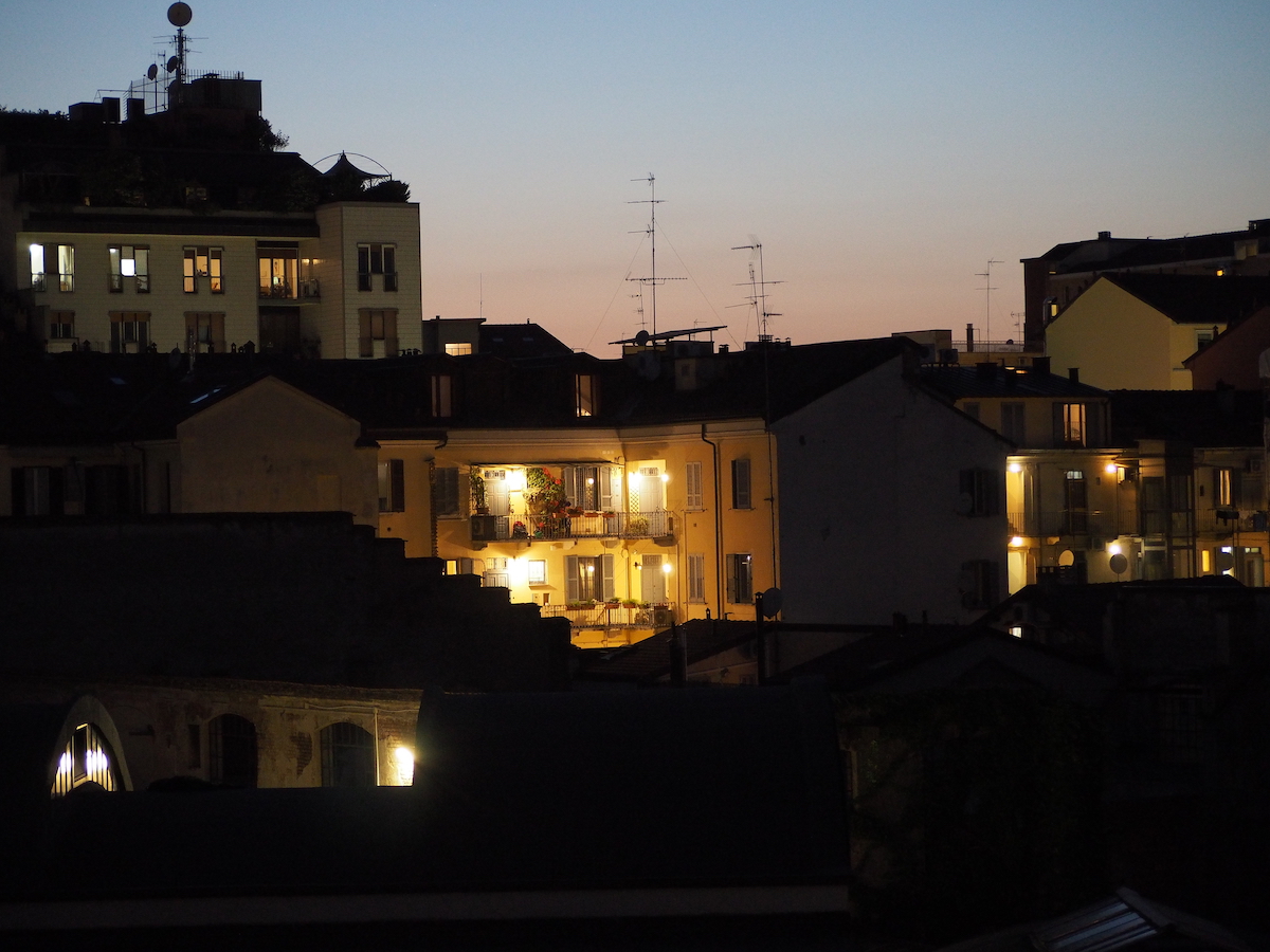
However, I managed to "unmark" one of these (i.e. I fulfilled it, in seafaring jargon...), just few days ago: around 9.30 pm I noticed that the lights on the two balconies closest to me were forming a small, well lit area, with a warm and welcoming atmosphere, just in the center of the scene, while all around the darkness was looming. This is how I came up with the idea of capturing that feeling, using the photographic technique called zooming: by manually giving a fast rotation to the magnification ring of a zoom lens just while you are shooting, you get an image that is sharp only in the centre, while the rest is taken up by radial stripes starting right from the center giving the image a sense that can be of speed or movement, and at the same time driving the observer's attention towards the only "readable" point, in its center
(4) I already noticed that these houses give their best in the so-called golden hour, that is to say that short period before sunrise (or after sunset) in which the lights are still (or already) on but the sky is no longer (or still) completely dark, and the colors are warm and unusual: sooner or later I'll get up and be ready very early in the morning, trying to immortalize them with that rare rosy light…
The... additional idea
However, taking a shot like this is relatively trivial: you put the camera on the tripod, shoot using a sufficiently long shutter speed (easy, this: in this period after the suunset, the scene is always very dark...) and in the meantime you quickly turn the zoom ring (such kind of lens is mandatory for this technique), possibly without moving the camera and in a uniform and tear-free way. Thus, however, the central area is "readable", but not really sharp: the zooming effect simply increases as you move away from the center of the image, an area in which it is minimal
On the other hand, just to make things a bit more complex, I wanted to try to make the central area with the balconies of the houses lit up… fully clear and sharp, without any zooming, limiting the swathes only to the dark area surrounding it. This effect cannot be obtained with the camera alone: it is necessary to digitally merge, in the post-processing phase, two different images: a sharp one (still, without zooming) from which to take the central area only, and another (complementary to the first one), in which the the radial blur effect is limited to adjacent buildings only, which are visible even if they are in the dark
The realization
1 – Shooting
Well, one thing is to have an idea, but... being able to really make it is actually another thing (moreover, up to that moment I had never tried the zooming effect). Also, I was in a hurry: the interesting period of time after sunset lasts only a few minutes, and the brightness of the scene fades fast, with the sky quickly darkening from a charming pinkish blue to… black. And in that short period I had to assemble the tripod, the camera and the lens(5), possibly trying to have enough time, more than that necessary for the minimum number of shots, to be able to have more material available and even a little margin in case of error
(5) to achieve this effect, I mounted the telephoto zoom without hesitation (the Lumix G Vario 45-200 mm f/4-5.6 OIS), because... it's a mandatory choice: it's the only one in my set providing the necessary magnification to make it clear that the houses in the center are the main subject of the image
So I "jumped in", except to realize very soon that the brightness of the external lights of the balconies was much higher than the surrounding one, so I thought it would be better to take two series of three shots each (with three exposure values and varying the magnification relative to the lit area), in order to recover part of the difference using the HDR technique
 |
 |
|
|
An example of the different zoom ratio of each of the series of three photos at different exposures (these frames are those taken with the correct exposure, according to the camera):
Luckily, the series that I could not use is the one with higher magnification, where – seen in retrospect – the lit group of houses fills too large a space to obtain a good rendering of the zooming effect in the remaining image area. The one on the left, on the other hand, seemed perfect to me for build the type of view I meant |
||
I would have liked to do the same again for the shots taken in "zooming" mode but, in practice, in the short time left before the scene became too dark I managed to take… only one, the one with a magnification like the first series (this hitch made impossible to use the second one, more enlarged)
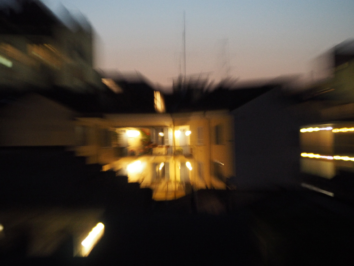 |
Here is the image where I applied the zooming effect: comparing it with the two previous pictures, one can see how the illuminated houses are indeed "legible", but certainly cannot be defined as "sharp" The only usable image was luckily suitable(6) to match the series that I thought to be the best one! |
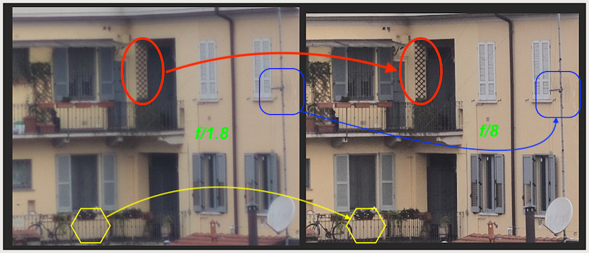
(6) of course, the best would have been that it was perfectly suited to the corresponding series (in the sense that the enlargement of the same subject, in the series of static photos and in the "zoomed" one, was identical). Instead, probably due to my imperfect synchronism between the pressing of the shutter button and the start of the manual rotation of the magnification dial, unfortunately the "zoomed" photo has a slightly - but visible - larger magnification than the static ones, so I was forced to manually "scale down" that image to make it coincide with the other. I didn't manage it perfectly, and something of this misalignment can still be seen in the final image
2 – Post-processing
This stage, which was crucial for the image I wanted to create, required two completely different operations:
- HDR: starting from the three pictures taken in sequence with a bracketing of +/- 0.7 stops in addiion to the one with correct exposure, this processing has generated a fourth image with a lower dynamic range (i.e. with less difference between the shaded areas and the fully illuminated ones). To do this I used HDRtist, a simplified but efficient software package for the creation of this kind of images
- Photo retouching: this is the core operation to form the final image: the central area is "removed" from the zoomed photo, perfectly superimposed to the static one, making visible the underlying still picture, so that the area of the illuminated houses appear clear and sharp. To do this, I used Photoshop's Layers and Mask features
3 – The finishing touches
Once the most impactful part of the final image was completed, it was time to refine the overall look of the resulting picture, by fulfilling the last few steps:
- Final image composition: according to my tastes, this photo gives its best if the illuminated houses stay at the center of an approximately squared image, with the radial lines given by the "zooming" effect forming a subject with central symmetry. It was the easiest part, obtainable by carefully positioning the cutting lines of the Crop tool over the whole available image
- Author's signature "in tone" with the image: as I often do with my best images, I add them a "signature" with the photo editing tools, trying to create it "in tone" with the image, i.e matching both its style and colors' palette. In this case I tried to do something more: since the lower right corner of the image was particularly dark and without any of the bright stripes resulting from the "zooming", I thought I'd make it more interesting by adding a signature being itself part of the image, making it look like one of the streaks of light. Putting this idea into practice involved the following steps:
- create the signature using a font suitable for the image with Photoshop's Text tool
- paint it with an appropriate color shading (brighter towards the center of the image, darker away from it) using the Gradient tool
- distort the writing so obtained in such a way that it apparenty looks lying in perspective (a modification performed manually, with the Distort tool) and in a size appropriate with respect to the surrounding image
- Darkening of the sky: a friend of mine, seeing in advance the resulting photo, pointed out that the area of the sky at the top, too lightened, was unbalancing the overall symmetry of the image. So, following his advice, I progressively darkened that part with CameraRAW's Dehaze tool (ie. "Remove haze")
- Adding a frame: the last step was to digitally create a "frame", this time limited to adding a simple and thin white outline, with the Canvas Size tool
4 - Choosing the right title
The last touch, even if not strictly photographic, was the choice of the name to give to the image: I heard that in newspapers and in general in the publishing environment it's not the content's author who creates the title of the work, but a sort of "title writer" specilized in this task; but I'm glad I don't have to follow these rules. I prefer to create it myself, so that it is a little "effect", attracting people's attention
For this image I have considered what, in my opinion, constitute its main elements:
- the houses, and the sense of protection they emanate under the warm yellow light
- the "zooming" effect that makes people think of something that quickly brings the subject into focus
- the fact that the focus is clearly directed towards the houses
So I eventually came to select the two English terms focus and home, also thinking to "Letter From Home", a beautiful 1989 jazz album by Pat Metheny. At this point I did some tests, trying to exploit the typical conciseness of the English language, to check how they sounded: Focus on Home, Focusing Home... up to the final idea: "focusing@home", which I propose below, together with the finished work
The final result
|
focusing@home |

(Ivan – June 20, 2023)
.